by Annabelle | 11 Jun, 2015 |
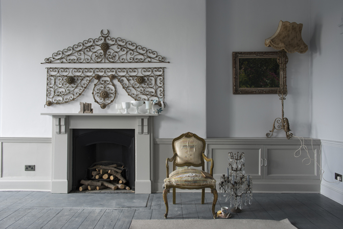
Living Room in ‘Wevet’ No.273 & ‘Purbeck Stone’ No.275 | Estate Emulsion & Estate Eggshell The hugely popular Scandinavian style of decorating layers greys to create an understated decorating look. Layer F&B’s easy greys to create a Gustavian feel that’s calm and relaxed and works in any style of home. Use ‘Ammonite’ on the walls with ‘Purbeck Stone’ on the woodwork and ‘Wevet’ on ceilings for a slice of Scandinavia in your own home. Purbeck Stone No.275, Ammonite No.274, Wevet No.273, Cornforth White No.228 ...
by Annabelle | 8 Jun, 2015 |
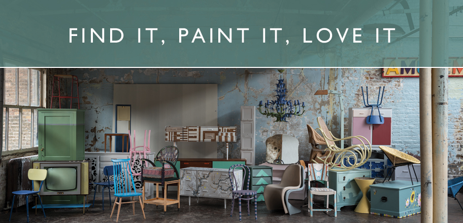
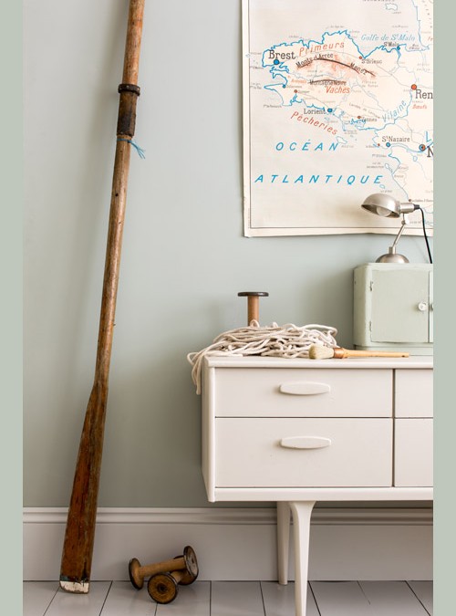
When we think about decorating and adding colour to our homes, we tend to focus on the walls, leaving the interior trim and furniture as an after-thought. But when it comes to creating beautiful interiors, it pays to get creative with paint. By custom painting furniture pieces or introducing colour to your interior trim (such as skirting boards and base boards, chair or dado rails, banisters, doors and door frames), you can inject personality and interest to your décor. Whether your style is bold and bright or soft and subtle, a freshly painted dresser, chair or table will revive your interiors and introduce a splash of your favourite hues to your home. There is something exciting and satisfying about finding an old piece of furniture for not much money, seeing its potential and renovating it to look lovely in your...
by Annabelle | 5 Jun, 2015 |
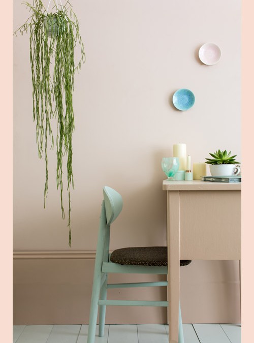
PINK GROUND Pink Ground creates a humble beauty in the home, making rooms feel pretty, soft edged and accessible. Although certainly warm, this pink is not sugary or infantile, rather it feels more like a diluted plaster colour where walls look almost nude. Use with a slightly stronger colour on the woodwork, like Setting Plaster, to create a lighter room; because the tones are close the feel is almost of camouflaged beauty with no strong contrasts or hard lines. Similarly accent colours should stay cloudy and soft. Pale Powder sits perfectly alongside Pink Ground; use it on either furniture for a more relaxed feel, or on the floor to complement the whimsical pastel palette on the walls and woodwork. Pink Ground No.202 Setting Plaster No.231 Pale Powder No.204 Teresa’s...
by Annabelle | 3 Jun, 2015 |
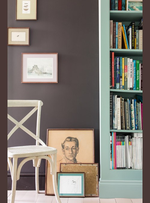
TANNER’S BROWN Although we are craving lighter, paler tones in 2015, darker tones remain best where natural light is lacking. Create darker, dramatic spaces with Tanner’s Brown, and at the same time make other areas feel lighter in comparison. This earth brown feels totally timeless and has an artisan feel to it. It is best used on the skirting boards as well as the walls, to keep it grounded and to prevent a light line around the bottom of the room, which can look hard. For a smudge effect use Dead Salmon on other woodwork and Joa’s White on ceilings. Muted Oval Room Blue looks magical when used as an accent colour. Tanner’s Brown No.255 Oval Room Blue No.85 Dead Salmon No.28 Hardwick...
by Annabelle | 1 Jun, 2015 |
LIGHT BLUE The use of Light Blue in the home is intended to create an interior where colours shift and change like the landscape. We instinctively gravitate towards colours that remind us of the softer side of life to make our homes into an oasis of calm away from the brashness of modern life. To create an almost transparent interior, contrast the colour’s silvery, smoky qualities with the unexpectedly cool grey Dimpse, a colour inspired by the tones of twilight. Create a feeling of relaxed movement by adding an accent of Lamp Room Gray on the floor, feature wall or furniture, and Blackened on the ceiling. Light Blue No.22 Dimpse No.277 Lamp Room Gray No.88 Blackened No....