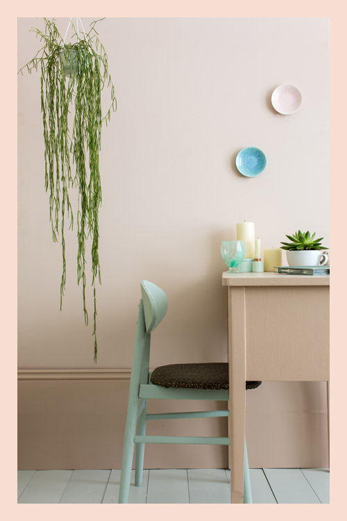
PINK GROUND
Pink Ground creates a humble beauty in the home, making rooms feel pretty, soft edged and accessible. Although certainly warm, this pink is not sugary or infantile, rather it feels more like a diluted plaster colour where walls look almost nude. Use with a slightly stronger colour on the woodwork, like Setting Plaster, to create a lighter room; because the tones are close the feel is almost of camouflaged beauty with no strong contrasts or hard lines. Similarly accent colours should stay cloudy and soft. Pale Powder sits perfectly alongside Pink Ground; use it on either furniture for a more relaxed feel, or on the floor to complement the whimsical pastel palette on the walls and woodwork.


Pink Ground No.202
Setting Plaster No.231
Pale Powder No.204
Teresa’s Green No.236