by Annabelle | 4 Aug, 2015 |
Living room with walls in Blackened No.2011 Estate Emulsion and trim in Down Pipe No.26 Estate Eggshell We recommend choosing colours that all have the same tonal weight. It’s best to decorate floor by floor: considering the sightlines between rooms – there’s no need for military precision, but it is worth envisioning how colours will complement the adjacent rooms. It can be rather effective to reverse wall and woodwork colours room by room, switching the colour of the walls in the main area to the woodwork colour of the other rooms. This creates a feeling of continuity throughout, and varies drama, as some rooms will be lighter than others, but still feel connected. Hall with walls in Oval Room Blue No.85, Cornforth White No.228 and Brinjal No.222 Estate Emulsion with woodwork in Wimborne White No.239 Estate...
by Annabelle | 14 Jul, 2015 |
Hall with walls in Dix Blue No.82 Estate Emulsion and Breakfast Room Green No.81 Estate Emulsion A common question is how to make ceilings appear taller, and the technique behind this is to reduce the amount of contrast between the colour on the walls, cornicing or coving and ceiling. Using the same colour on the woodwork, walls and on the cornice or coving will make the walls appear taller. It also helps to use a white on the ceiling that is sympathetic with the wall colour so that you’re less aware of where the walls end, and the ceiling begins. Try pairing Ammonite walls with a ceiling in Wevet for example. Or you can gently graduate colour, by using progressively lighter tones from walls, to cornicing or coving and then a lighter shade again on the ceiling – this creates a soft lofty feel and feels as if the walls are gently graduating into the ceiling. Finally, a very easy technique is to simply use the same colour on the walls and any cornicing or coving and up and onto the ceiling. Bedroom with walls and ceiling in Hague Blue No.30 and bookshelf in Black Blue No.95 Estate Eggshell...
by Annabelle | 10 Jul, 2015 |
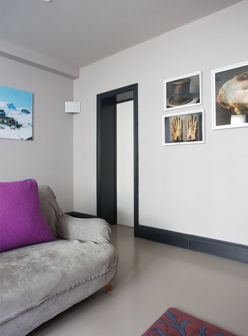
Hall with walls in Cinder Rose No.246 Estate Emulsion & Dimity No.2008 Modern Emulsion Costly extensions and architects aside, colour can be used to alter the shape of a room. When planning your colour scheme remember that a darker wall colour will bring it towards you, whereas a lighter colour creates the illusion it’s further away. You can also prevent narrow hallways from appearing ‘tunnel like’ by painting the end wall a darker shade than the side walls. The same principle works within a rectangular room that you’d like to make appear squarer. Hall with walls in Strong White No.2001 Estate Emulsion and woodwork in Down Pipe No.26 Estate...
by Annabelle | 7 Jul, 2015 |
Bedroom in Green Blue No.84 & All White No.2005 | Estate Emulsion When it comes to choosing white it’s really important to choose a white that complements the other colours in the scheme to prevent them from jarring. Each of F&B’s whites have different undertones making them more suited to different colours. Whites like Great White and Dimity, for example, have red undertones so pair beautifully with pinks and reds like Calamine and Rectory Red. Cabbage White has fresh blue undertones so it’s the perfect white to use with other blues. James White is the ideal partner to greens as it has soft green undertones that will create a cohesive look. While Pointing, with its soft creamy undertones works beautifully with yellows like House White and Dayroom Yellow. These unique undertones also mean you can use these whites as colours in their own right when paired with All White which contains no pigment except white. Blackened will read as a cool grey when paired with All White, and similarly the pink tones of Great White are emphasised....
by Annabelle | 3 Jul, 2015 |
Living Room in Pavillion Gray No.242 & All White No.2005 | Estate Emulsion & Estate Eggshell Although there are a myriad of decorating styles and techniques, when it comes to colour choice and Interior design, there are no hard and fast rules, it’s about what you feel comfortable with, and your vision for your home. Whether with paint or wallpaper, there are three popular ways of decorating: COLOURED WALLS AND WHITE WOODWORK A traditional style is to apply one colour to the walls and a white gloss on the woodwork. Visually this is a very clean look, but it can sometimes appear harsh depending on the contrast between colours. To soften the contrast choose an empathetic companion colour for the ceiling. This will make the contrast more gradual, and as a result the room will look surprisingly spacious. LIGHT WALLS AND DARKER WOODWORK A marvellous way to create light and space is to use the lightest colour on the largest surface area, such as the walls, and a darker tone on woodwork. This works well if you are using a neutral scheme, and gives a more ‘decorated’ feel. The use of a dark colour on skirting boards, not only makes the walls appear lighter in contrast, but it also creates a strong contemporary aesthetic, making everything above feel elongated and lighter in contrast. Dining room with walls and ceiling in All White No.2005 Estate Emulsion, trim in Pointing No.2003 and cupboards in Teresa’s Green No.236 Estate Eggshell Bedroom with walls in Silvergate BP 878 & trim in Plummet No.272 Estate Eggshell ONE COLOUR USED...