by Annabelle | 5 May, 2015 |
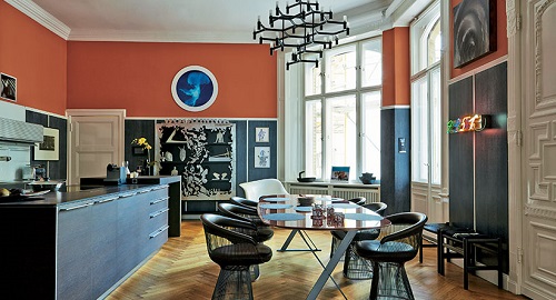
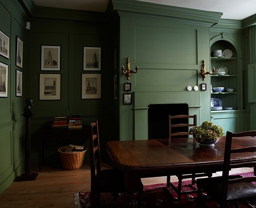
Dining Room in ‘Charlotte’s Locks’ No.268 and ‘Railings’ No.31 Estate Emulsion The dining room is the theatre of the home, whether used as a place for family to discuss the happenings of the day or as a room for entertaining and dinner parties, the décor sets the scene… Strong colours can work wonderfully in dining rooms, creating a dramatic, intimate atmosphere that’s perfect for entertaining. Rich tones like ‘Brinjal’, ‘Calke Green’ and ‘Railings’ work especially well in dining rooms that are often lit by candlelight. These rich, velvety tones are intensified by candlelight and take on a wonderful jewel like quality. Dining Room in ‘Calke Green’ No.34 Estate Emulsion Dining Room in ‘Railings’ No.31 Estate Emulsion In dining rooms with a more informal feel, it works well to add stronger colour as an accent. Try painting the floor in bolder tones like ‘Radicchio’, ‘Pelt’ or ‘Mole’s Breath’, to add strong colour without dominating the space. To create a sophisticated, but more everyday look consider layering the neutrals to give the scheme real depth. Try ‘Slipper Satin’ on walls with ‘Hardwick White’ woodwork, and ‘Pigeon’ on the chairs. Add some pattern to this scheme by using ‘Brocade’ BP3208 or ‘Yukutori’ BP4303 on a feature wall, or even as a table runner. Dining Room walls in ‘Slipper Satin’ No.2004 and woodwork in ‘Hardwick White’ No.5 Estate Emulsion & Estate Eggshell Dining Room walls in ‘Clunch’ No.2009, ceiling in ‘All White’ No.2005 and woodwork in ‘Wimborne White’ No.239 Estate Emulsion & Estate...

by Annabelle | 30 Apr, 2015 |
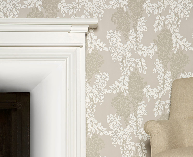
After the heaviness, clutter and dark colours of Victorian interiors, people wanted something less formal. Edwardian style was seen as a breath of fresh air. Homes were less status symbols and more refuges. There were fewer, larger rooms, with lighter spaces and there was a return to a simpler more pared down approach to colour and generally the use of fewer colours. Fresh, pastel colours were used to create this sense of light and space. Pastel blues like ‘Skylight’ No. 205 or ‘Pale Powder’ No. 204, fresh greens like ‘Tunsgate Green’ No. 250 and ‘Green Ground’ No. 206, and pinks such as ‘Calamine’ No. 230, as well as simple creams like ‘Tallow’ No. 203 and ‘Ringwold Ground’ No. 208 can all be used to create this look today. Wallpapers were similarly feminine with flowers and floral designs highly favoured to achieve the Edwardian ideals of freshness and light. These would be best represented by ‘Peony’, ‘Wisteria’ and ‘Jasmine’. To complete the scheme woodwork, cornices and ceilings were painted bright whites like ‘All White’ No. 2005, ‘Wimborne White’ No. 239 and ‘Pointing’ No....

by Annabelle | 28 Apr, 2015 |
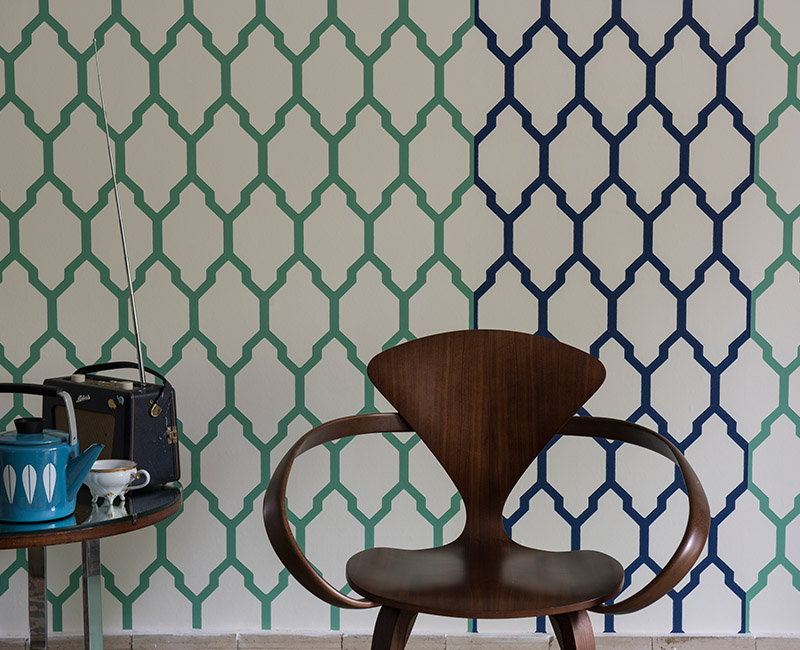
Art Deco interior design began in Europe. By the end of World War I, Art Deco was a very popular choice and was the leading style until the end of the second World War in 1945. The style is characterised by rich colours, bold geometric shapes and lavish ornamentation, a look that has retained real influence today. Colour was strong and compromising – there was a lot of black! ‘Pitch Black’ No. 256 or ‘Black Blue’ No. 95 in Full Gloss and huge amounts of chrome immediately evoke this look. Strong yellows like ‘Babouche’ No. 223 were also used to create a bold look along with clean reds like ‘Incarnadine’ No. 248 and ‘Blazer’ No. 212. These were very often combined with a grey colour on the woodwork – either a light grey like ‘Blackened’ No. 2011 or a dark grey such as ‘Down Pipe’ No. 26. For a less dramatic art deco look, creams and neutrals along with shades of green can also be used. Choose neutrals like ‘Skimming Stone’ No. 241, ‘Shaded White’ No. 201 and the slightly stronger ‘Dove Tale’ No. 267 combined with ‘Churlish Green’ No. 251 or ‘Arsenic’ No. 214. Art Deco is all about symmetry and balance so geometric wallpapers were the most popular. Although not strictly from this period the following wallpapers could be used in strong colours; Stripes, Tessella, Lattice, Ranelagh and even...

by Annabelle | 28 Apr, 2015 |
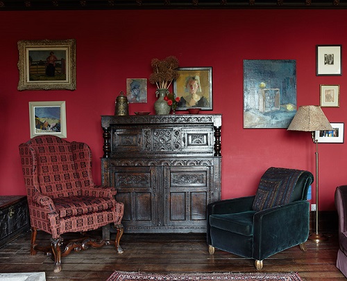
The Victorian era stretched for over fifty years and over this period decorating styles changed and evolved. It was also a great era of change in the home as mass production of items meant that homes could upgrade much more easily and there was a great range of architectural styles. The Victorian era was largely dominated by stronger shades, but for an early Victorian look choose lighter pinks like Dimity and Calluna along with iridescent whites such as Great White. The classic Victorian palette includes crisp blues like Parma Gray, rich greens like Saxon Green and solar yellows such as Citron. However by the end of the century colours became more muted and soft again best represented by Cinder Rose and Green Smoke. Wallpaper was increasingly popular in the Victorian era, and was dominated by damasks and large floral, bird and animal motifs best reflected in ‘Silvergate’, ‘Orangerie’ and ‘Versailles’. The background colours to these papers would have been fairly drab in the main, like ‘French Gray’ or ‘London Stone’. Ornate plasterwork was used on ceilings, roses and cornices usually coloured in warm neutrals like ‘Joa’s White’ No. 226 or ‘Archive’ No. 227 for a rich sumptuous...

by Annabelle | 25 Apr, 2015 |
The Georgian era is often referred to as The Age of Elegance. The most important element in Georgian Interiors is perfect proportion alongside carefully balanced colours. Georgian rooms typically included several decorative features such as plaster and stuccowork, elaborate doorways, panelling, gilding or marble effect paint work. The colours used were muted and sophisticated, a look perfectly suited to the Farrow & Ball palette. To create this look chooser dirtied colours like ‘Mouse’s Back’ No. 40, ‘Dead Salmon’ No. 28, ‘Lichen’ No. 19, ‘Pigeon’ No. 25 and ‘Picture Gallery Red’ No. 42. Typically these would have had a sheen so Modern Emulsion would be the most appropriate finish to choose. As the style evolved, colour became lighter with the use of dusky pinks like ‘Setting Plaster’ No. 231, soft greys like ‘Pavilion Gray’ No. 242, and cleaner greens and blues like ‘Folly Green’ No. 76 and ‘Lulworth Blue’ No. 89 as well as the introduction of strong yellows like ‘India Yellow’ No. 66. All these would be used in a matt finish like our Estate Emulsion. If you are lucky enough to have original plaster work or panelling then colours like ‘Off-White’ No. 3, ‘Fawn’ No. 10 and ‘Olive’ No. 13 would be most...
